Next Level Sailing Website
Creative Direction • UX • UI • Prototyping
Overview
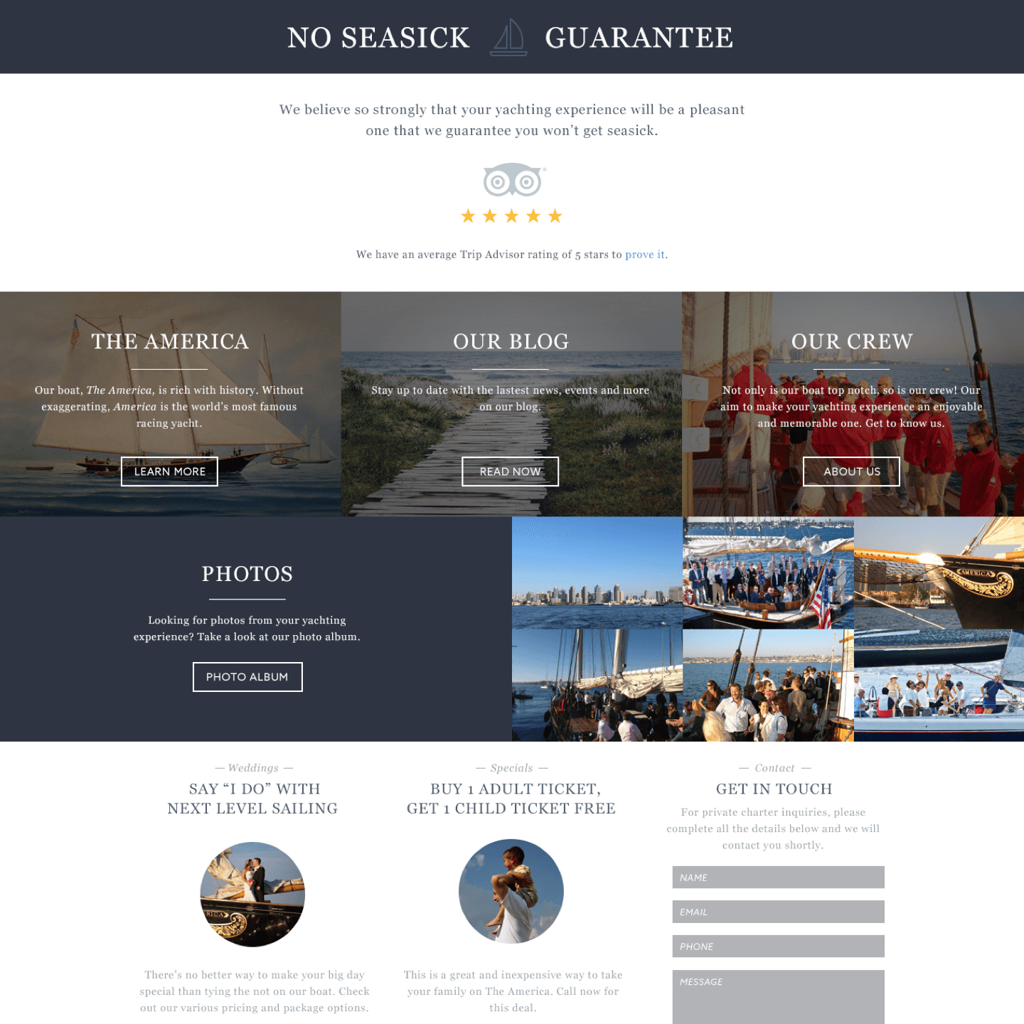
Next Level Sailing based in San Diego, CA, approached me to do a re-design on their site after seeing the work I had done for Sail NYC and their brands in the past. They wanted a refreshed look that showcased their boat, the “America,” their event packages, photos and more.
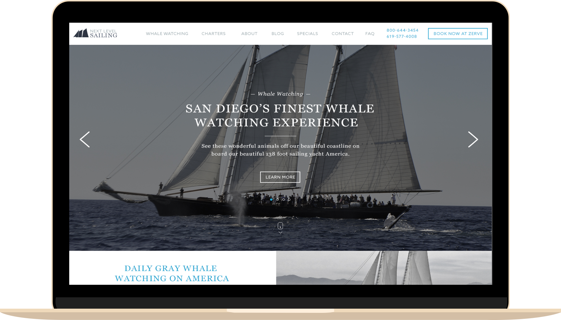
I used beautiful san serif fonts coupled with big images and a tight, boxy grid layout for the various sections.
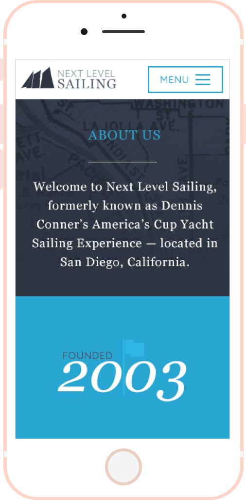
Mobile Responsive
One major thing the previous Next Level Sailing site was lacking was the site being mobile-friendly. The way I designed the layout for desktop made it an easy transition to all device screens.
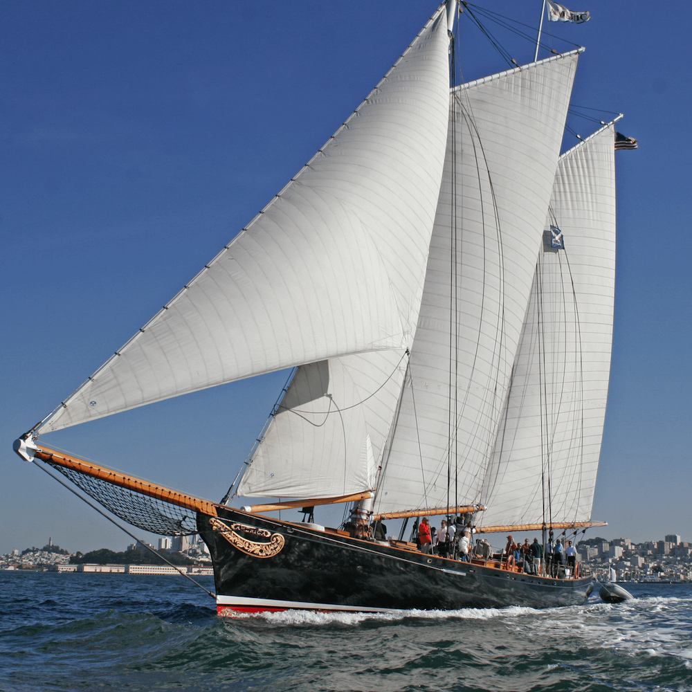
The America
It was really important to the client that the America was the focal point of the site as this boat is one of their main draws. Sprinkled throughout the site in various backgrounds and event packages, The America was featured being used for whale watching, weddings, company parties and more.
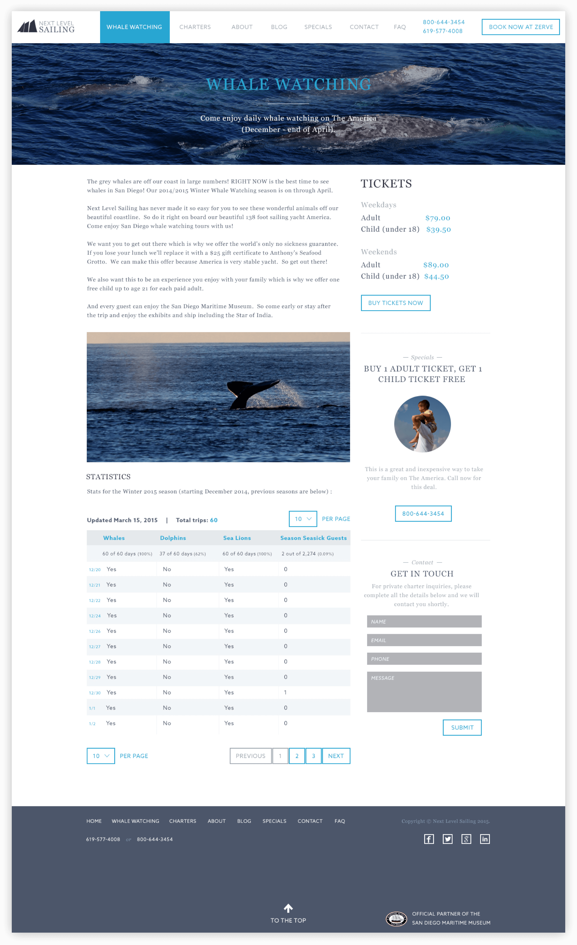
Whale watching is one of the biggest draws to Next Level Sailing as they offer a whale watching experience like no other. Visitors can quickly check the whale watching schedule, buy tickets, and read up on whale watching information.
