CheckWait Mobile App
Overview
WaitCheck is an app I designed in 2015. The team at WaitCheck had an idea to create a crowd-sourced app similar to Yelp or the check-in feature on Facebook but unique in it’s own way. Basically, the premise of the app would be for users to use the app to check in on the wait time at a restaurant, bar, a coffee shop – anywhere that could have a line and a wait. Alternatively, users at a location like a restaurant could post how many people are in line or how long the wait is.


Map & Cards
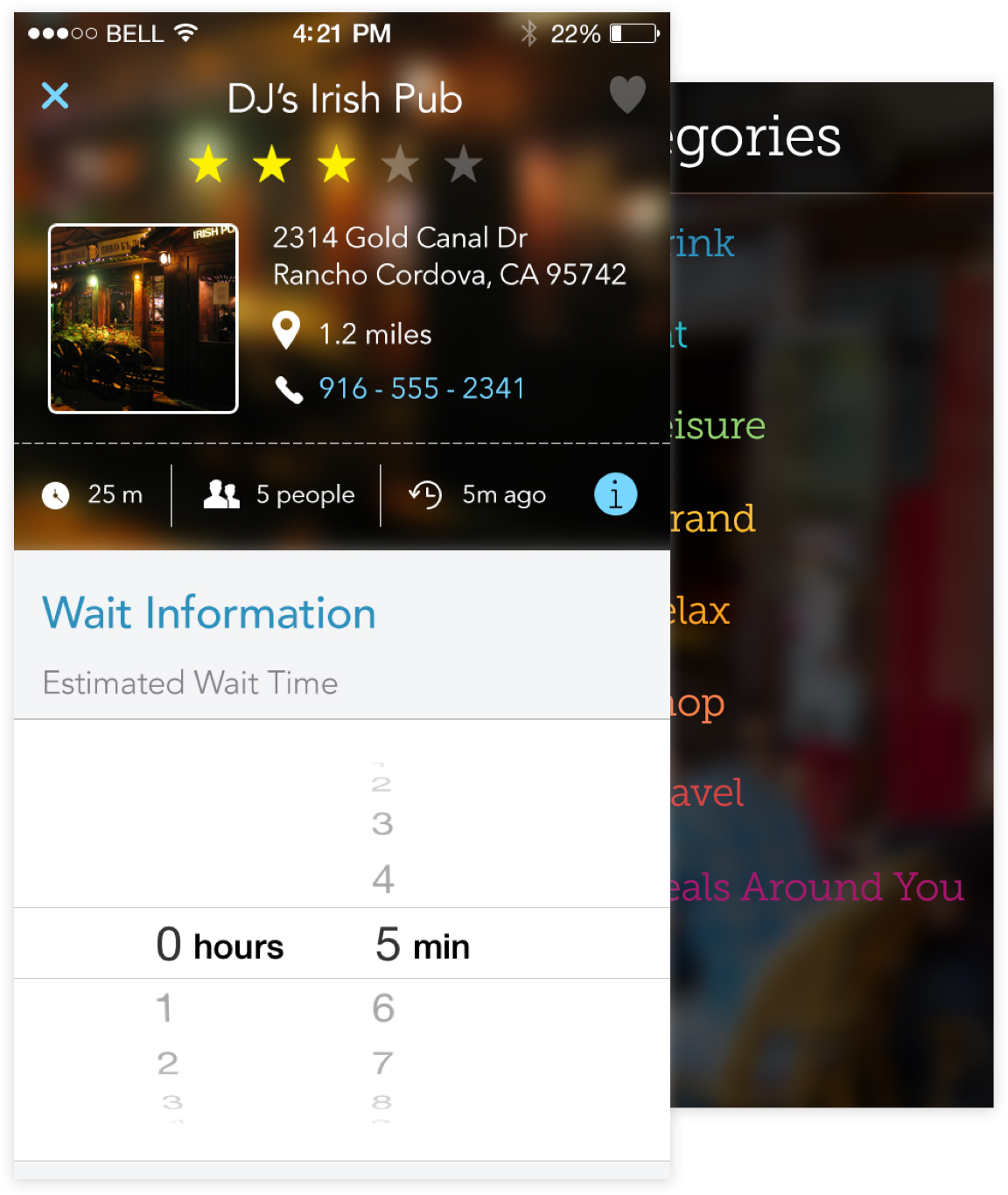
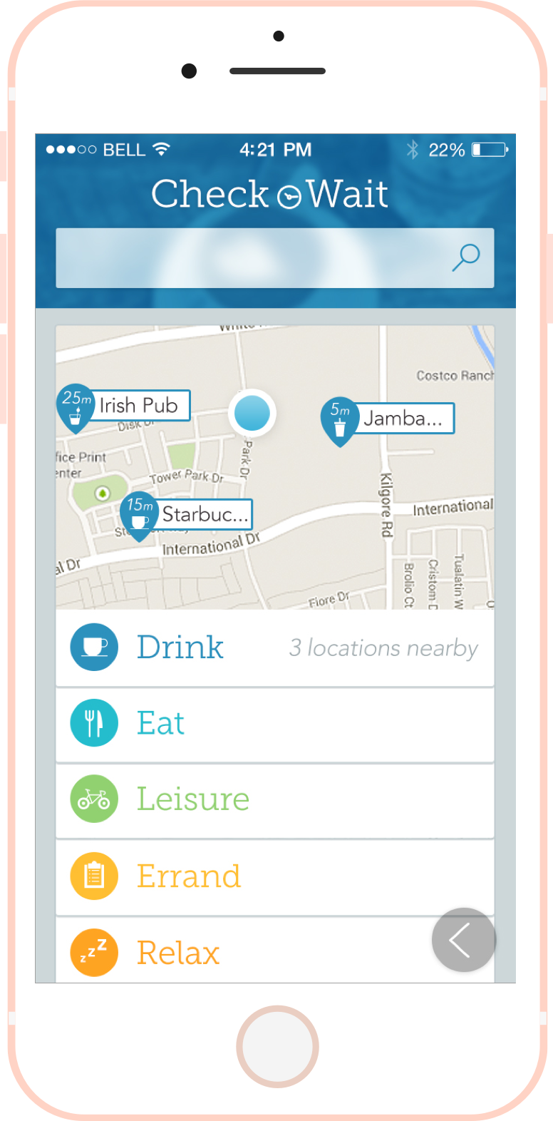
Using a minified map feature, a user could tap on a card below to select a category and then the category would be displayed on the map along with the wait time and the name of the place. The user could then tap on one of the map pins and go in to a view showing details on the place.
Map View
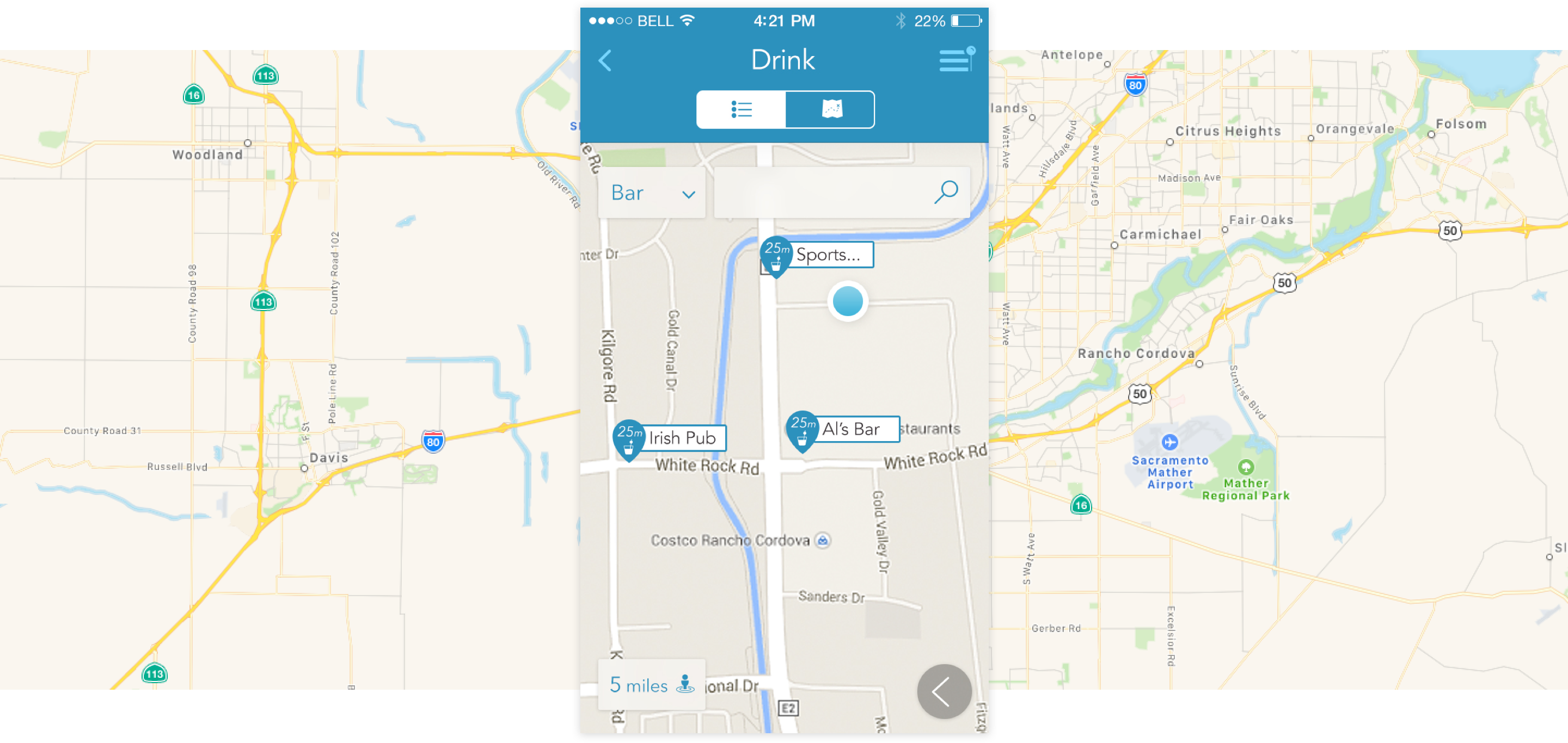
One other nice feature about this app is users could switch between the card view with the small map or a full-screen map view like the one shown here. They could then search, toggle the location type, and switch between list view or map view.
